Ingage Analytics
View reports to determine which presentations are most popular and better understand when and how often specific users are using each presentation.
Measuring the performance of presentations among team members can be accessed from within the Teams Admin console at https://teams.ingage.io/login.
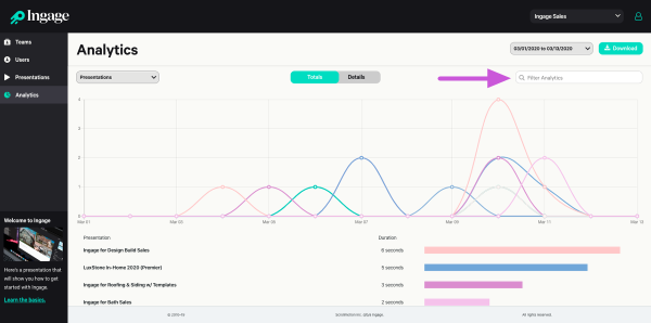
1. Select the Analytics tab from the left side menu to view the reports. Once on the Analytics tab, data and chart will be displayed reflecting each presentation within a team and overall usage within the time frame selected.
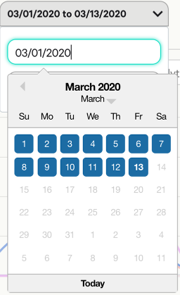
2. Change the timeframe for the data being displayed. There is an option to manually enter a date range or select from a drop down calendar.

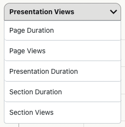
3. Select the drop-down menu for "Report Type" to access various reports listed below:
4. Select Totals to view a chart or Details for a more detailed column view.
5. Select "Download" to export the report into a .CSV file, which can be viewed in Excel or a similar spreadsheet program.
Ingage Tip: Which presentations are your top performers within Ingage? This data can be used to help other team members improve their results and better understand what customers are asking to see. This will help you improve your presentations.
6. Filter Your Search: For a quick search, you can now filter by each column: Date, Email, Presentations name, and Section name