The latest update to Pop Ups includes a variety of new features that support customized layouts. With these enhancements, you can incorporate text, images, videos, shapes, galleries, and interactive elements such as Buttons, Hotspots & Scrollmotions.
View a short video overview of the new features.
Do I need to update or change pop ups in my presentations?
No, pop ups in your presentations will continue to behave as designed, and you can edit your existing pop ups as you normally do. To take advantage of these new features, a pop up must be converted to the new style.
There are two options to convert a pop up. Using your iPad you can remove the pop up and add a new one. The other option is to edit the presentation with the Desktop version of Ingage, and use the Upgrade Action to Pop Up conversion utility to help with the transition.
View a short to see how to convert pop ups using Ingage Desktop.
Do I need to do anything differently to use the new pop up features?
The workflow to add pop ups has been changed to help speed up the editing process and allows for more control over how a pop up behaves.
- Choose Show Pop Up from the Button, Point of Interest or Hotspot menus or add the Show Pop Up Action to a component.
- Tap the orange Edit Pop Up pill button, or tap Configure from the Action tab of the inspector.
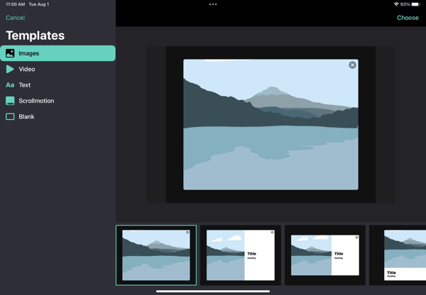
- Select a template from the Template picker.
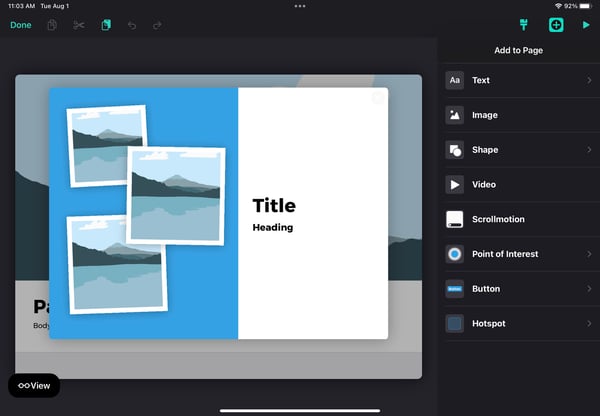
- Use the new flexible editing features to add/remove components, add text, shapes, components and style the pop up.
Media and Read Me pop up components have been consolidated under a single button and action titled Pop Up. Pop Up templates provide options for all types of media, text and images, including the original Media and Read Me layouts.
What is the the Template picker?
When adding a pop up, choose from one of the 30+ templates, for 5 different categories of pop ups. These templates have been developed to help you get started, but they are only suggested layouts, and can be changed to meet your needs after adding a pop up to a page.
You can no longer change to a different template after a pop up has been added. You can add and remove components, but if you would like to use a different template, delete the pop-up and add one with your desired layout.
How do I add components?
Add, arrange, and style components on pop ups the same way you add components to a page. From any pop up, tap the plus button in the navigation bar to see the list of supported components.
- Edit the pop up by tapping the orange Edit Pop Up pill button, or tap Edit Pop Up from the Action Tab of the inspector to edit and style the pop up.
- Tap the plus button in the top right corner of the screen.
- Select the component from the menu and it will be placed on the pop up.
- Position the component and edit style options using the inspector panel on right.
Not all design component types are supported on a pop up. The following components cannot be added:
- Buttons and Actions that open other pop up (i.e. nested pop ups)
- Image Carousel, Compare & Gallery Components.
What are the new style and settings to control pop up behavior?
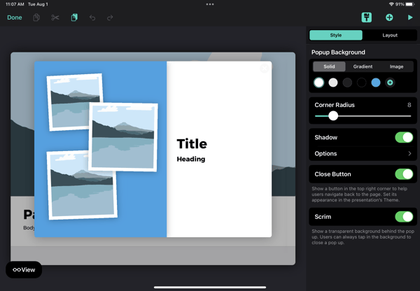
Several new options have been added to the pop up inspector that allow you to position and style the pop up. These setting transform the the pop up design and editing experience to one that is very similar to the experience of designing and editing pages.
Style Settings
|
Setting |
Description |
| Pop up Background |
Chose the type of background for the pop up. Solid Color - Set the background color to one of your theme colors or set a new color. Gradient - Set a background to a fade between two colors. Image - Show an image as the background instead of a color |
|
Corner Radius |
Set your own value for the corner radius of the pop up. Use a value of 0 for a square corner. The size of the pop up also affects the look of the corners. The same corner radius value may look different on a large or small pop up. |
|
Shadow |
Display a drop shadow and control the style. Off- No shadow is displayed. On - Display a drop shadow. When selected, you can set the X,Y, blur, and opacity values. |
|
Close Button |
Show a close button in the top right corner to help users navigate back to the page. A close button helps the user know how to exit the pop up but can interfere with a desired design. |
|
Show Scrim |
Show a transparent background behind the pop. By displaying the scrim, the pop up is more distinct and provides a visual area to tap to close the pop up. |
|
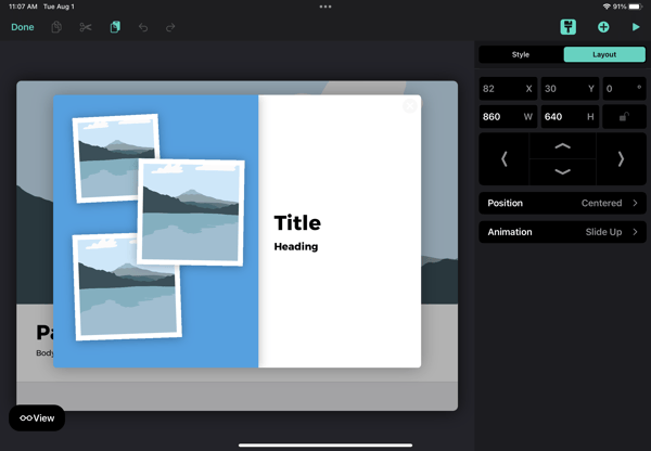
Position
|
Control the position of the pop up. Centered - The pop up will be centered above the navigation bar. Relative - The pop up will be centered near the button that opened it. Manual - Position the pop up anyplace on the page using the X, Y controls. Note, X and Y position controls are disabled unless the manual option is selected. |
|
Size |
Set the size of the pop up using the Width (W) and Height (H) controls in the inspector. The maximum values are 1024 for the width and 768 for the height. |
|
Presentation Style |
Set how the pop up is presented to the viewer. Slide Up - The pop up slides up from the navigation bar when displayed, and slides down when closed. Fade - The pop up fades in when displayed and fades out when closed. |
Layout Settings
|
Setting |
Description |
|
Position
|
Control the position of the pop up. Centered - The pop up will be centered above the navigation bar. Relative - The pop up will be centered near the button that opened it. Manual - Position the pop up anyplace on the page using the X, Y controls. Note, X and Y position controls are disabled unless the manual option is selected. |
|
Size |
Set the size of the pop up using the Width (W) and Height (H) controls in the inspector. |
|
Animation |
Set how the pop up is presented to the viewer. Slide Up - The pop up slides up from the navigation bar when displayed, and slides down when closed. Fade In- The pop up fades in when displayed and fades out when closed. |